Your AI presentation looks good. But can you actually present it?
5 mistakes that make even a good-looking presentation difficult to deliver — and how to fix them
Your slides are competing with your audience’s smartphones.
Good luck with that
AI can make the slides.
But a live presentation has different rules
A document is read
The reader sets the pace. They can pause, reread a paragraph and zoom in on a chart.
Details have room to breathe.
A talk is experienced
The audience follows your pace. They have to listen, look and understand at the same time.
The slide should support your voice, not compete with it.
In this real project, a company executive was presenting corporate security and retail monitoring. Claude helped prepare the initial material; I adapted it for a 15-minute live talk. The topic and business arguments stayed the same.
Your slides are ready.
Your speech isn’t
A finished deck is not a rehearsed talk.
AI doesn’t know where your speaker pauses, which point needs an explanation or how long a transition takes.
The source material contained more than the executive could comfortably deliver in 15 minutes. I estimated the duration, then checked it in rehearsal with the speaker.
Time the talk
Say it aloud, including pauses and slide changes. Silent reading is not a rehearsal.
Rehearse together
Notice where the speaker rushes, repeats a point or needs a clearer visual cue.
Trim and distribute
Cut excess detail and spread information across slides to match the delivery.

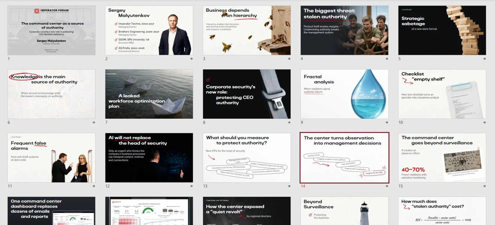
Make your slides fit your speech
Great presentation.
If you’re sitting in the front row
Your laptop is not a conference room.
Dense paragraphs and long lists can look perfectly respectable on a small screen. From the back row, they become texture.
I used large, meaningful headlines, prominent figures and short visual anchors. The speaker gives the explanation; the slide makes the main point easy to see.


Can you still see the main idea?
Your audience has a smartphone.
And it’s winning
Reveal the point you’re explaining. Give the next one its turn.
When everything appears at once, the audience reads ahead while the speaker is still explaining the first number.
I used sequential reveals, animations and AI-assisted transitions to guide attention. The information stayed the same; the delivery changed.


Three original slide states, shown in order · Select a frame to pause and inspect it
It directs attention
Serious business doesn’t require boring slides
An abstract service doesn’t have to look like a stock photo of a handshake.
For this project, I used expressive typography, associative imagery, visual metaphors and relevant humour.
The “Open another checkout!” meme connected to a familiar retail problem: checkout queues. The reference had a job to do.


Make the reference relevant
“Thank you for your attention.”
Now what?
A polite ending is not a next step.
You’ve explained the offer. Now tell the audience what to do with it.
The final presentation included a concrete invitation to start a pilot project, followed by the speaker’s contacts. A proposal they could act on, with a person they could reach.


Make the next step obvious
Same business arguments
Ready for live delivery
Timing, hierarchy, metaphors and motion — working together to support the speaker.


Is your presentation ready
for a live talk?
Tick each question you can confidently answer “yes” to
0 of 5 checked

Let’s make your presentation work on stage
Free 25-minute presentation review
Send me your slides. We’ll look at what helps your delivery — and what gets in the way.
- Timing and structure
- Readability
- Visual priorities
- Support for the speaker
No slides yet?
Bring a draft, source materials or the outline of your talk. We can discuss what needs to be ready for the stage.
25 minutes · free